9. Clustering#
9.1. Overview#
As part of exploratory data analysis, it is often helpful to see if there are meaningful subgroups (or clusters) in the data. This grouping can be used for many purposes, such as generating new questions or improving predictive analyses. This chapter provides an introduction to clustering using the K-means algorithm, including techniques to choose the number of clusters.
9.2. Chapter learning objectives#
By the end of the chapter, readers will be able to do the following:
Describe a situation in which clustering is an appropriate technique to use, and what insight it might extract from the data.
Explain the K-means clustering algorithm.
Interpret the output of a K-means analysis.
Differentiate between clustering, classification, and regression.
Identify when it is necessary to scale variables before clustering, and do this using Python.
Perform K-means clustering in Python using
scikit-learn.Use the elbow method to choose the number of clusters for K-means.
Visualize the output of K-means clustering in Python using a colored scatter plot.
Describe advantages, limitations and assumptions of the K-means clustering algorithm.
9.3. Clustering#
Clustering is a data analysis task involving separating a data set into subgroups of related data. For example, we might use clustering to separate a data set of documents into groups that correspond to topics, a data set of human genetic information into groups that correspond to ancestral subpopulations, or a data set of online customers into groups that correspond to purchasing behaviors. Once the data are separated, we can, for example, use the subgroups to generate new questions about the data and follow up with a predictive modeling exercise. In this course, clustering will be used only for exploratory analysis, i.e., uncovering patterns in the data.
Note that clustering is a fundamentally different kind of task than classification or regression. In particular, both classification and regression are supervised tasks where there is a response variable (a category label or value), and we have examples of past data with labels/values that help us predict those of future data. By contrast, clustering is an unsupervised task, as we are trying to understand and examine the structure of data without any response variable labels or values to help us. This approach has both advantages and disadvantages. Clustering requires no additional annotation or input on the data. For example, while it would be nearly impossible to annotate all the articles on Wikipedia with human-made topic labels, we can cluster the articles without this information to find groupings corresponding to topics automatically. However, given that there is no response variable, it is not as easy to evaluate the “quality” of a clustering. With classification, we can use a test data set to assess prediction performance. In clustering, there is not a single good choice for evaluation. In this book, we will use visualization to ascertain the quality of a clustering, and leave rigorous evaluation for more advanced courses.
Given that there is no response variable, it is not as easy to evaluate the “quality” of a clustering. With classification, we can use a test data set to assess prediction performance. In clustering, there is not a single good choice for evaluation. In this book, we will use visualization to ascertain the quality of a clustering, and leave rigorous evaluation for more advanced courses.
As in the case of classification, there are many possible methods that we could use to cluster our observations to look for subgroups. In this book, we will focus on the widely used K-means algorithm [Lloyd, 1982]. In your future studies, you might encounter hierarchical clustering, principal component analysis, multidimensional scaling, and more; see the additional resources section at the end of this chapter for where to begin learning more about these other methods.
Note
There are also so-called semisupervised tasks, where only some of the data come with response variable labels/values, but the vast majority don’t. The goal is to try to uncover underlying structure in the data that allows one to guess the missing labels. This sort of task is beneficial, for example, when one has an unlabeled data set that is too large to manually label, but one is willing to provide a few informative example labels as a “seed” to guess the labels for all the data.
9.4. An illustrative example#
In this chapter we will focus on a data set from
the palmerpenguins R package [Horst et al., 2020]. This
data set was collected by Dr. Kristen Gorman and
the Palmer Station, Antarctica Long Term Ecological Research Site, and includes
measurements for adult penguins (Fig. 9.1) found near there [Gorman et al., 2014].
Our goal will be to use two
variables—penguin bill and flipper length, both in millimeters—to determine whether
there are distinct types of penguins in our data.
Understanding this might help us with species discovery and classification in a data-driven
way. Note that we have reduced the size of the data set to 18 observations and 2 variables;
this will help us make clear visualizations that illustrate how clustering works for learning purposes.
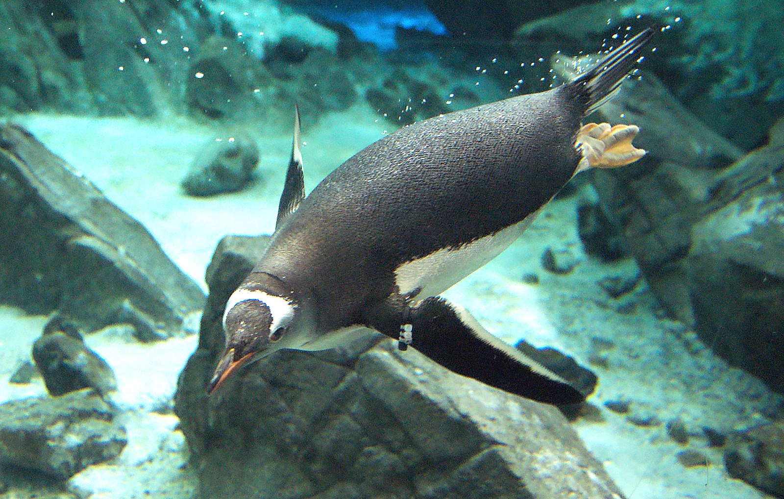
Fig. 9.1 A Gentoo penguin.#
Before we get started, we will set a random seed. This will ensure that our analysis will be reproducible. As we will learn in more detail later in the chapter, setting the seed here is important because the K-means clustering algorithm uses randomness when choosing a starting position for each cluster.
import numpy as np

np.random.seed(6)
Now we can load and preview the penguins data.
import pandas as pd

penguins = pd.read_csv("data/penguins.csv")
penguins
| bill_length_mm | flipper_length_mm | |
|---|---|---|
| 0 | 39.2 | 196 |
| 1 | 36.5 | 182 |
| 2 | 34.5 | 187 |
| 3 | 36.7 | 187 |
| 4 | 38.1 | 181 |
| 5 | 39.2 | 190 |
| 6 | 36.0 | 195 |
| 7 | 37.8 | 193 |
| 8 | 46.5 | 213 |
| 9 | 46.1 | 215 |
| 10 | 47.8 | 215 |
| 11 | 45.0 | 220 |
| 12 | 49.1 | 212 |
| 13 | 43.3 | 208 |
| 14 | 46.0 | 195 |
| 15 | 46.7 | 195 |
| 16 | 52.2 | 197 |
| 17 | 46.8 | 189 |
We will begin by using a version of the data that we have standardized, penguins_standardized,
to illustrate how K-means clustering works (recall standardization from Chapter 5).
Later in this chapter, we will return to the original penguins data to see how to include standardization automatically
in the clustering pipeline.
penguins_standardized
| bill_length_standardized | flipper_length_standardized | |
|---|---|---|
| 0 | -0.641361 | -0.189773 |
| 1 | -1.144917 | -1.328412 |
| 2 | -1.517922 | -0.921755 |
| 3 | -1.107617 | -0.921755 |
| 4 | -0.846513 | -1.409743 |
| 5 | -0.641361 | -0.677761 |
| 6 | -1.238168 | -0.271104 |
| 7 | -0.902464 | -0.433767 |
| 8 | 0.720106 | 1.192860 |
| 9 | 0.645505 | 1.355522 |
| 10 | 0.962559 | 1.355522 |
| 11 | 0.440353 | 1.762179 |
| 12 | 1.205012 | 1.111528 |
| 13 | 0.123299 | 0.786203 |
| 14 | 0.626855 | -0.271104 |
| 15 | 0.757407 | -0.271104 |
| 16 | 1.783170 | -0.108442 |
| 17 | 0.776057 | -0.759092 |
Next, we can create a scatter plot using this data set to see if we can detect subtypes or groups in our data set.
import altair as alt

scatter_plot = alt.Chart(penguins_standardized).mark_circle().encode(
    x=alt.X("flipper_length_standardized").title("Flipper Length (standardized)"),
    y=alt.Y("bill_length_standardized").title("Bill Length (standardized)")
)
Fig. 9.2 Scatter plot of standardized bill length versus standardized flipper length.#
Based on the visualization in Fig. 9.2, we might suspect there are a few subtypes of penguins within our data set. We can see roughly 3 groups of observations in Fig. 9.2, including:
a small flipper and bill length group,
a small flipper length, but large bill length group, and
a large flipper and bill length group.
Data visualization is a great tool to give us a rough sense of such patterns when we have a small number of variables. But if we are to group data—and select the number of groups—as part of a reproducible analysis, we need something a bit more automated. Additionally, finding groups via visualization becomes more difficult as we increase the number of variables we consider when clustering. The way to rigorously separate the data into groups is to use a clustering algorithm. In this chapter, we will focus on the K-means algorithm, a widely used and often very effective clustering method, combined with the elbow method for selecting the number of clusters. This procedure will separate the data into groups; Fig. 9.3 shows these groups denoted by colored scatter points.
Fig. 9.3 Scatter plot of standardized bill length versus standardized flipper length with colored groups.#
What are the labels for these groups? Unfortunately, we don’t have any. K-means, like almost all clustering algorithms, just outputs meaningless “cluster labels” that are typically whole numbers: 0, 1, 2, 3, etc. But in a simple case like this, where we can easily visualize the clusters on a scatter plot, we can give human-made labels to the groups using their positions on the plot:
small flipper length and small bill length (orange cluster),
small flipper length and large bill length (blue cluster).
and large flipper length and large bill length (red cluster).
Once we have made these determinations, we can use them to inform our species classifications or ask further questions about our data. For example, we might be interested in understanding the relationship between flipper length and bill length, and that relationship may differ depending on the type of penguin we have.
9.5. K-means#
9.5.1. Measuring cluster quality#
The K-means algorithm is a procedure that groups data into K clusters. It starts with an initial clustering of the data, and then iteratively improves it by making adjustments to the assignment of data to clusters until it cannot improve any further. But how do we measure the “quality” of a clustering, and what does it mean to improve it? In K-means clustering, we measure the quality of a cluster by its within-cluster sum-of-squared-distances (WSSD), also called inertia. Computing this involves two steps. First, we find the cluster centers by computing the mean of each variable over data points in the cluster. For example, suppose we have a cluster containing four observations, and we are using two variables, \(x\) and \(y\), to cluster the data. Then we would compute the coordinates, \(\mu_x\) and \(\mu_y\), of the cluster center via
In the first cluster from the example, there are 4 data points. These are shown with their cluster center (standardized flipper length -0.35, standardized bill length 0.99) highlighted in Fig. 9.4
Fig. 9.4 Cluster 0 from the penguins_standardized data set example. Observations are small blue points, with the cluster center highlighted as a large blue point with a black outline.#
The second step in computing the WSSD is to add up the squared distance between each point in the cluster and the cluster center. We use the straight-line / Euclidean distance formula that we learned about in Chapter 5. In the 4-observation cluster example above, we would compute the WSSD \(S^2\) via
These distances are denoted by lines in Fig. 9.5 for the first cluster of the penguin data example.
Fig. 9.5 Cluster 0 from the penguins_standardized data set example. Observations are small blue points, with the cluster center highlighted as a large blue point with a black outline. The distances from the observations to the cluster center are represented as black lines.#
The larger the value of \(S^2\), the more spread out the cluster is, since large \(S^2\) means that points are far from the cluster center. Note, however, that “large” is relative to both the scale of the variables for clustering and the number of points in the cluster. A cluster where points are very close to the center might still have a large \(S^2\) if there are many data points in the cluster.
After we have calculated the WSSD for all the clusters, we sum them together to get the total WSSD. For our example, this means adding up all the squared distances for the 18 observations. These distances are denoted by black lines in Fig. 9.6.
Fig. 9.6 All clusters from the penguins_standardized data set example. Observations are small orange, blue, and yellow points with cluster centers denoted by larger points with a black outline. The distances from the observations to each of the respective cluster centers are represented as black lines.#
Since K-means uses the straight-line distance to measure the quality of a clustering, it is limited to clustering based on quantitative variables. However, note that there are variants of the K-means algorithm, as well as other clustering algorithms entirely, that use other distance metrics to allow for non-quantitative data to be clustered. These are beyond the scope of this book.
9.5.2. The clustering algorithm#
We begin the K-means algorithm by picking K, and randomly assigning a roughly equal number of observations to each of the K clusters. An example random initialization is shown in Fig. 9.7
Fig. 9.7 Random initialization of labels. Each cluster is depicted as a different color and shape.#
Then K-means consists of two major steps that attempt to minimize the sum of WSSDs over all the clusters, i.e., the total WSSD:
Center update: Compute the center of each cluster.
Label update: Reassign each data point to the cluster with the nearest center.
These two steps are repeated until the cluster assignments no longer change. We show what the first three iterations of K-means would look like in Fig. 9.8. Each row corresponds to an iteration, where the left column depicts the center update, and the right column depicts the label update (i.e., the reassignment of data to clusters).
Fig. 9.8 First three iterations of K-means clustering on the penguins_standardized example data set. Each pair of plots corresponds to an iteration. Within the pair, the first plot depicts the center update, and the second plot depicts the reassignment of data to clusters. Cluster centers are indicated by larger points that are outlined in black.#
Note that at this point, we can terminate the algorithm since none of the assignments changed in the third iteration; both the centers and labels will remain the same from this point onward.
Note
Is K-means guaranteed to stop at some point, or could it iterate forever? As it turns out, thankfully, the answer is that K-means is guaranteed to stop after some number of iterations. For the interested reader, the logic for this has three steps: (1) both the label update and the center update decrease total WSSD in each iteration, (2) the total WSSD is always greater than or equal to 0, and (3) there are only a finite number of possible ways to assign the data to clusters. So at some point, the total WSSD must stop decreasing, which means none of the assignments are changing, and the algorithm terminates.
9.5.3. Random restarts#
Unlike the classification and regression models we studied in previous chapters, K-means can get “stuck” in a bad solution. For example, Fig. 9.9 illustrates an unlucky random initialization by K-means.
Fig. 9.9 Random initialization of labels.#
Fig. 9.10 shows what the iterations of K-means would look like with the unlucky random initialization shown in Fig. 9.9
Fig. 9.10 First four iterations of K-means clustering on the penguins_standardized example data set with a poor random initialization. Each pair of plots corresponds to an iteration. Within the pair, the first plot depicts the center update, and the second plot depicts the reassignment of data to clusters. Cluster centers are indicated by larger points that are outlined in black.#
This looks like a relatively bad clustering of the data, but K-means cannot improve it. To solve this problem when clustering data using K-means, we should randomly re-initialize the labels a few times, run K-means for each initialization, and pick the clustering that has the lowest final total WSSD.
9.5.4. Choosing K#
In order to cluster data using K-means, we also have to pick the number of clusters, K. But unlike in classification, we have no response variable and cannot perform cross-validation with some measure of model prediction error. Further, if K is chosen too small, then multiple clusters get grouped together; if K is too large, then clusters get subdivided. In both cases, we will potentially miss interesting structure in the data. Fig. 9.11 illustrates the impact of K on K-means clustering of our penguin flipper and bill length data by showing the different clusterings for K’s ranging from 1 to 9.
Fig. 9.11 Clustering of the penguin data for K clusters ranging from 1 to 9. Cluster centers are indicated by larger points that are outlined in black.#
If we set K less than 3, then the clustering merges separate groups of data; this causes a large total WSSD, since the cluster center (denoted by large shapes with black outlines) is not close to any of the data in the cluster. On the other hand, if we set K greater than 3, the clustering subdivides subgroups of data; this does indeed still decrease the total WSSD, but by only a diminishing amount. If we plot the total WSSD versus the number of clusters, we see that the decrease in total WSSD levels off (or forms an “elbow shape”) when we reach roughly the right number of clusters (Fig. 9.12).
Fig. 9.12 Total WSSD for K clusters ranging from 1 to 9.#
9.6. K-means in Python#
We can perform K-means in Python using a workflow similar to those
in the earlier classification and regression chapters.
Returning to the original (unstandardized) penguins data,
recall that K-means clustering uses straight-line distance to decide which points are similar to
each other. Therefore, the scale of each of the variables in the data
will influence which cluster data points end up being assigned.
Variables with a large scale will have a much larger
effect on deciding cluster assignment than variables with a small scale.
To address this problem, we typically standardize our data before clustering,
which ensures that each variable has a mean of 0 and standard deviation of 1.
The StandardScaler function in scikit-learn can be used to do this.
from sklearn.preprocessing import StandardScaler
from sklearn.compose import make_column_transformer
from sklearn import set_config

# Output dataframes instead of arrays
set_config(transform_output="pandas")

preprocessor = make_column_transformer(
    (StandardScaler(), ["bill_length_mm", "flipper_length_mm"]),
    verbose_feature_names_out=False,
)
preprocessor
ColumnTransformer(transformers=[('standardscaler', StandardScaler(),
                                 ['bill_length_mm', 'flipper_length_mm'])],
                  verbose_feature_names_out=False)
In a Jupyter environment, please rerun this cell to show the HTML representation or trust the notebook. On GitHub, the HTML representation is unable to render, please try loading this page with nbviewer.org.
ColumnTransformer(transformers=[('standardscaler', StandardScaler(),
                                 ['bill_length_mm', 'flipper_length_mm'])],
verbose_feature_names_out=False)['bill_length_mm', 'flipper_length_mm']
StandardScaler()
To indicate that we are performing K-means clustering, we will create a KMeans
model object. It takes at
least one argument: the number of clusters n_clusters, which we set to 3.
from sklearn.cluster import KMeans

kmeans = KMeans(n_clusters=3)
kmeans
KMeans(n_clusters=3)In a Jupyter environment, please rerun this cell to show the HTML representation or trust the notebook.
On GitHub, the HTML representation is unable to render, please try loading this page with nbviewer.org.
KMeans(n_clusters=3)
To actually run the K-means clustering, we combine the preprocessor and model object
in a Pipeline, and use the fit function. Note that the K-means
algorithm uses a random initialization of assignments, but since we set
the random seed in the beginning of this chapter, the clustering will be reproducible.
from sklearn.pipeline import make_pipeline

penguin_clust = make_pipeline(preprocessor, kmeans)
penguin_clust.fit(penguins)
penguin_clust
Pipeline(steps=[('columntransformer',
                 ColumnTransformer(transformers=[('standardscaler',
                                                  StandardScaler(),
                                                  ['bill_length_mm',
                                                   'flipper_length_mm'])],
                                   verbose_feature_names_out=False)),
                ('kmeans', KMeans(n_clusters=3))])
In a Jupyter environment, please rerun this cell to show the HTML representation or trust the notebook. On GitHub, the HTML representation is unable to render, please try loading this page with nbviewer.org.
Pipeline(steps=[('columntransformer',
                 ColumnTransformer(transformers=[('standardscaler',
                                                  StandardScaler(),
                                                  ['bill_length_mm',
                                                   'flipper_length_mm'])],
                                   verbose_feature_names_out=False)),
('kmeans', KMeans(n_clusters=3))])ColumnTransformer(transformers=[('standardscaler', StandardScaler(),
['bill_length_mm', 'flipper_length_mm'])],
verbose_feature_names_out=False)['bill_length_mm', 'flipper_length_mm']
StandardScaler()
KMeans(n_clusters=3)
The fit KMeans object—which is the second item in the
pipeline, and can be accessed as penguin_clust[1]—has a lot of information
that can be used to visualize the clusters, pick K, and evaluate the total WSSD.
Let’s start by visualizing the clusters as a colored scatter plot! In
order to do that, we first need to augment our
original penguins data frame with the cluster assignments.
We can access these using the labels_ attribute of the clustering object
(“labels” is a common alternative term to “assignments” in clustering), and
add them to the data frame.
penguins["cluster"] = penguin_clust[1].labels_
penguins
| bill_length_mm | flipper_length_mm | cluster | |
|---|---|---|---|
| 0 | 39.2 | 196 | 1 |
| 1 | 36.5 | 182 | 1 |
| 2 | 34.5 | 187 | 1 |
| 3 | 36.7 | 187 | 1 |
| 4 | 38.1 | 181 | 1 |
| 5 | 39.2 | 190 | 1 |
| 6 | 36.0 | 195 | 1 |
| 7 | 37.8 | 193 | 1 |
| 8 | 46.5 | 213 | 2 |
| 9 | 46.1 | 215 | 2 |
| 10 | 47.8 | 215 | 2 |
| 11 | 45.0 | 220 | 2 |
| 12 | 49.1 | 212 | 2 |
| 13 | 43.3 | 208 | 2 |
| 14 | 46.0 | 195 | 0 |
| 15 | 46.7 | 195 | 0 |
| 16 | 52.2 | 197 | 0 |
| 17 | 46.8 | 189 | 0 |
Now that we have the cluster assignments included in the penguins data frame, we can
visualize them as shown in Fig. 9.13.
Note that we are plotting the un-standardized data here; if we for some reason wanted to
visualize the standardized data, we would need to use the fit and transform functions
on the StandardScaler preprocessor directly to obtain that first.
As in Chapter 4,
adding the :N suffix ensures that altair
will treat the cluster variable as a nominal/categorical variable, and
hence use a discrete color map for the visualization.
cluster_plot=alt.Chart(penguins).mark_circle().encode(
    x=alt.X("flipper_length_mm").title("Flipper Length").scale(zero=False),
    y=alt.Y("bill_length_mm").title("Bill Length").scale(zero=False),
    color=alt.Color("cluster:N").title("Cluster"),
)
Fig. 9.13 The data colored by the cluster assignments returned by K-means.#
As mentioned above,
we also need to select K
by finding where the “elbow” occurs in the plot of total WSSD versus the number of clusters.
The total WSSD is stored in the .inertia_ attribute
of the clustering object (“inertia” is the term scikit-learn uses to denote WSSD).
penguin_clust[1].inertia_
4.730719092276117
To calculate the total WSSD for a variety of Ks, we will
create a data frame that contains different values of k
and the WSSD of running K-means with each values of k.
To create this dataframe,
we will use what is called a “list comprehension” in Python,
where we repeat an operation multiple times
and return a list with the result.
Here is an examples of a list comprehension that stores the numbers 0-2 in a list:
[n for n in range(3)]
[0, 1, 2]
We can change the variable n to be called whatever we prefer
and we can also perform any operation we want as part of the list comprehension.
For example,
we could square all the numbers from 1-4 and store them in a list:
[number**2 for number in range(1, 5)]
[1, 4, 9, 16]
Next, we will use this approach to compute the WSSD for the K-values 1 through 9.
For each value of K,
we create a new KMeans model
and wrap it in a scikit-learn pipeline
with the preprocessor we created earlier.
We store the WSSD values in a list that we will use to create a dataframe
of both the K-values and their corresponding WSSDs.
Note
We are creating the variable ks to store the range of possible k-values,
so that we only need to change this range in one place
if we decide to change which values of k we want to explore.
Otherwise it would be easy to forget to update it
in either the list comprehension or in the data frame assignment.
If you are using a value multiple times,
it is always the safest to assign it to a variable name for reuse.
ks = range(1, 10)
wssds = [
    make_pipeline(
    	preprocessor,
    	KMeans(n_clusters=k)  # Create a new KMeans model with `k` clusters
    ).fit(penguins)[1].inertia_
    for k in ks
]

penguin_clust_ks = pd.DataFrame({
    "k": ks,
    "wssd": wssds,
})

penguin_clust_ks
| k | wssd | |
|---|---|---|
| 0 | 1 | 36.000000 |
| 1 | 2 | 11.576264 |
| 2 | 3 | 4.730719 |
| 3 | 4 | 3.343613 |
| 4 | 5 | 2.362131 |
| 5 | 6 | 1.678383 |
| 6 | 7 | 1.293320 |
| 7 | 8 | 0.975016 |
| 8 | 9 | 0.785232 |
Now that we have wssd and k as columns in a data frame, we can make a line plot
(Fig. 9.14) and search for the “elbow” to find which value of K to use.
elbow_plot = alt.Chart(penguin_clust_ks).mark_line(point=True).encode(
    x=alt.X("k").title("Number of clusters"),
    y=alt.Y("wssd").title("Total within-cluster sum of squares"),
)
Fig. 9.14 A plot showing the total WSSD versus the number of clusters.#
It looks like three clusters is the right choice for this data, since that is where the “elbow” of the line is the most distinct. In the plot, you can also see that the WSSD is always decreasing, as we would expect when we add more clusters. However, it is possible to have an elbow plot where the WSSD increases at one of the steps, causing a small bump in the line. This is because K-means can get “stuck” in a bad solution due to an unlucky initialization of the initial center positions as we mentioned earlier in the chapter.
Note
It is rare that the implementation of K-means from scikit-learn
gets stuck in a bad solution, because scikit-learn tries to choose
the initial centers carefully to prevent this from happening.
If you still find yourself in a situation where you have a bump in the elbow plot,
you can increase the n_init parameter
when creating the KMeans object, e.g., KMeans(n_clusters=k, n_init=10), to try more different random center initializations.
The larger the value the better from an analysis perspective,
but there is a trade-off that doing many clusterings could take a long time.
9.7. Exercises#
Practice exercises for the material covered in this chapter can be found in the accompanying worksheets repository in the “Clustering” row. You can launch an interactive version of the worksheet in your browser by clicking the “launch binder” button. You can also preview a non-interactive version of the worksheet by clicking “view worksheet.” If you instead decide to download the worksheet and run it on your own machine, make sure to follow the instructions for computer setup found in Chapter 13. This will ensure that the automated feedback and guidance that the worksheets provide will function as intended.
9.8. Additional resources#
Chapter 10 of An Introduction to Statistical Learning [James et al., 2013] provides a great next stop in the process of learning about clustering and unsupervised learning in general. In the realm of clustering specifically, it provides a great companion introduction to K-means, but also covers hierarchical clustering for when you expect there to be subgroups, and then subgroups within subgroups, etc., in your data. In the realm of more general unsupervised learning, it covers principal components analysis (PCA), which is a very popular technique for reducing the number of predictors in a data set.
9.9. References#
- GWF14
Kristen Gorman, Tony Williams, and William Fraser. Ecological sexual dimorphism and environmental variability within a community of Antarctic penguins (genus pygoscelis). PLoS ONE, 2014.
- HHG20
Allison Horst, Alison Hill, and Kristen Gorman. palmerpenguins: Palmer Archipelago penguin data. 2020. R package version 0.1.0. URL: https://allisonhorst.github.io/palmerpenguins/.
- JWHT13
Gareth James, Daniela Witten, Trevor Hastie, and Robert Tibshirani. An Introduction to Statistical Learning. Springer, 1st edition, 2013. URL: https://www.statlearning.com/.
- Llo82
Stuart Lloyd. Least square quantization in PCM. IEEE Transactions on Information Theory, 28(2):129–137, 1982. Originally released as a Bell Telephone Laboratories Paper in 1957.