4. Effective data visualization#
4.1. Overview#
This chapter will introduce concepts and tools relating to data visualization beyond what we have seen and practiced so far. We will focus on guiding principles for effective data visualization and explaining visualizations independent of any particular tool or programming language. In the process, we will cover some specifics of creating visualizations (scatter plots, bar plots, line plots, and histograms) for data using Python.
4.2. Chapter learning objectives#
By the end of the chapter, readers will be able to do the following:
Describe when to use the following kinds of visualizations to answer specific questions using a data set:
scatter plots
line plots
bar plots
histogram plots
Given a data set and a question, select from the above plot types and use Python to create a visualization that best answers the question.
Evaluate the effectiveness of a visualization and suggest improvements to better answer a given question.
Referring to the visualization, communicate the conclusions in non-technical terms.
Identify rules of thumb for creating effective visualizations.
Use the
altairlibrary in Python to create and refine the above visualizations using:graphical marks:
mark_point,mark_line,mark_circle,mark_bar,mark_ruleencoding channels:
x,y,color,shapelabeling:
titletransformations:
scalesubplots:
facet
Define the two key aspects of
altaircharts:graphical marks
encoding channels
Describe the difference in raster and vector output formats.
Use
chart.save()to save visualizations in.pngand.svgformat.
4.3. Choosing the visualization#
Ask a question, and answer it
The purpose of a visualization is to answer a question about a data set of interest. So naturally, the first thing to do before creating a visualization is to formulate the question about the data you are trying to answer. A good visualization will clearly answer your question without distraction; a great visualization will suggest even what the question was itself without additional explanation. Imagine your visualization as part of a poster presentation for a project; even if you aren’t standing at the poster explaining things, an effective visualization will convey your message to the audience.
Recall the different data analysis questions from Chapter 1. With the visualizations we will cover in this chapter, we will be able to answer only descriptive and exploratory questions. Be careful to not answer any predictive, inferential, causal or mechanistic questions with the visualizations presented here, as we have not learned the tools necessary to do that properly just yet.
As with most coding tasks, it is totally fine (and quite common) to make mistakes and iterate a few times before you find the right visualization for your data and question. There are many different kinds of plotting graphics available to use (see Chapter 5 of Fundamentals of Data Visualization [Wilke, 2019] for a directory). The types of plots that we introduce in this book are shown in Fig. 4.1; which one you should select depends on your data and the question you want to answer. In general, the guiding principles of when to use each type of plot are as follows:
scatter plots visualize the relationship between two quantitative variables
line plots visualize trends with respect to an independent, ordered quantity (e.g., time)
bar plots visualize comparisons of amounts
histograms visualize the distribution of one quantitative variable (i.e., all its possible values and how often they occur)
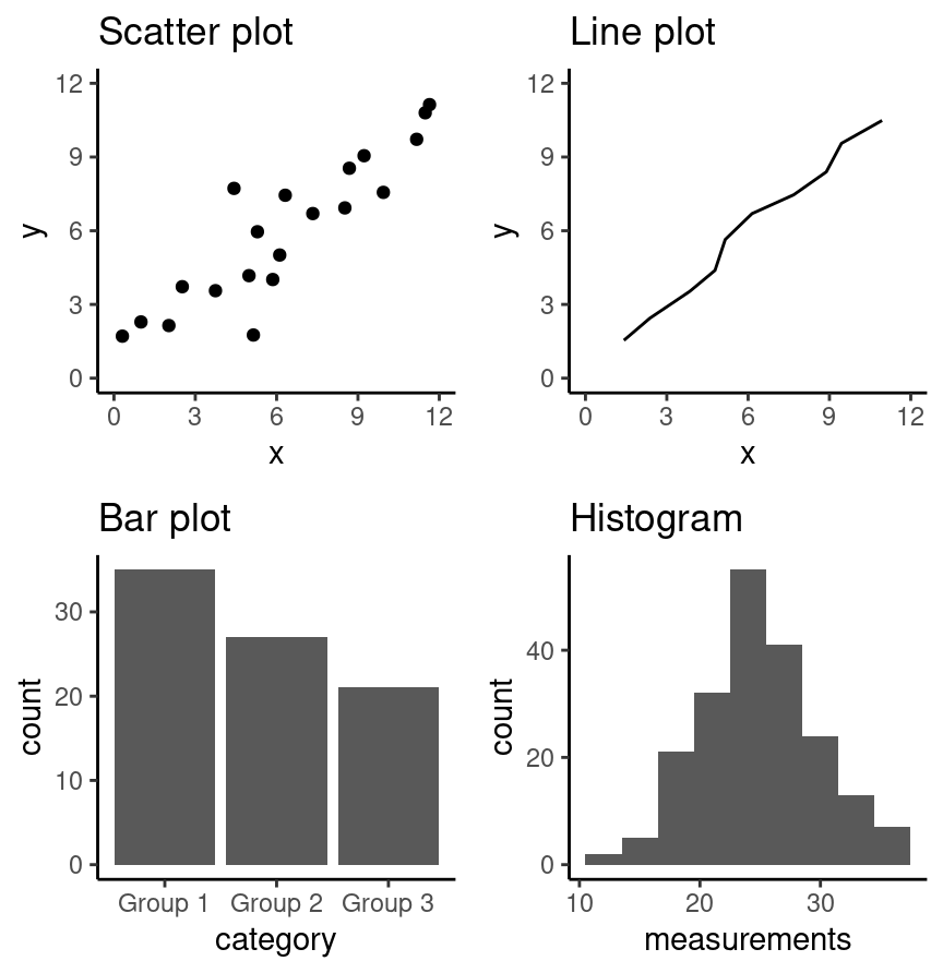
Fig. 4.1 Examples of scatter, line and bar plots, as well as histograms.#
All types of visualization have their (mis)uses, but three kinds are usually hard to understand or are easily replaced with an oft-better alternative. In particular, you should avoid pie charts; it is generally better to use bars, as it is easier to compare bar heights than pie slice sizes. You should also not use 3-D visualizations, as they are typically hard to understand when converted to a static 2-D image format. Finally, do not use tables to make numerical comparisons; humans are much better at quickly processing visual information than text and math. Bar plots are again typically a better alternative.
4.4. Refining the visualization#
Convey the message, minimize noise
Just being able to make a visualization in Python with altair (or any other tool
for that matter) doesn’t mean that it effectively communicates your message to
others. Once you have selected a broad type of visualization to use, you will
have to refine it to suit your particular need. Some rules of thumb for doing
this are listed below. They generally fall into two classes: you want to
make your visualization convey your message, and you want to reduce visual noise
as much as possible. Humans have limited cognitive ability to process
information; both of these types of refinement aim to reduce the mental load on
your audience when viewing your visualization, making it easier for them to
understand and remember your message quickly.
Convey the message
Make sure the visualization answers the question you have asked most simply and plainly as possible.
Use legends and labels so that your visualization is understandable without reading the surrounding text.
Ensure the text, symbols, lines, etc., on your visualization are big enough to be easily read.
Ensure the data are clearly visible; don’t hide the shape/distribution of the data behind other objects (e.g., a bar).
Make sure to use color schemes that are understandable by those with colorblindness (a surprisingly large fraction of the overall population—from about 1% to 10%, depending on sex and ancestry [Deeb, 2005]). For example, Color Schemes provides the ability to pick such color schemes, and you can check your visualizations after you have created them by uploading to online tools such as a color blindness simulator.
Redundancy can be helpful; sometimes conveying the same message in multiple ways reinforces it for the audience.
Minimize noise
Use colors sparingly. Too many different colors can be distracting, create false patterns, and detract from the message.
Be wary of overplotting. Overplotting is when marks that represent the data overlap, and is problematic as it prevents you from seeing how many data points are represented in areas of the visualization where this occurs. If your plot has too many dots or lines and starts to look like a mess, you need to do something different.
Only make the plot area (where the dots, lines, bars are) as big as needed. Simple plots can be made small.
Don’t adjust the axes to zoom in on small differences. If the difference is small, show that it’s small!
4.5. Creating visualizations with altair#
Build the visualization iteratively
This section will cover examples of how to choose and refine a visualization given a data set and a question that you want to answer,
and then how to create the visualization in Python using altair. To use the altair package, we need to first import it. We will also import pandas to use for reading in the data.
import pandas as pd
import altair as alt
Note
In this chapter, we will provide example visualizations using relatively small
data sets, so we are fine using the default settings in altair. However,
altair will raise an error if you try to plot with a data frame that has more
than 5,000 rows. The simplest way to plot larger data sets is to enable the
vegafusion data transformer right after you import the altair package:
alt.data_transformers.enable("vegafusion"). This will allow you to plot up to
100,000 graphical objects (e.g., a scatter plot with 100,000 points). To
visualize even larger data sets, see the altair documentation.
4.5.1. Scatter plots and line plots: the Mauna Loa CO\(_{\text{2}}\) data set#
The Mauna Loa CO\(_{\text{2}}\) data set, curated by Dr. Pieter Tans, NOAA/GML and Dr. Ralph Keeling, Scripps Institution of Oceanography, records the atmospheric concentration of carbon dioxide (CO\(_{\text{2}}\), in parts per million) at the Mauna Loa research station in Hawaii from 1959 onward [Tans and Keeling, 2020]. For this book, we are going to focus on the years 1980-2020.
Question: Does the concentration of atmospheric CO\(_{\text{2}}\) change over time, and are there any interesting patterns to note?
To get started, we will read and inspect the data:
# mauna loa carbon dioxide data
co2_df = pd.read_csv(
    "data/mauna_loa_data.csv",
    parse_dates=["date_measured"]
)
co2_df
| date_measured | ppm | |
|---|---|---|
| 0 | 1980-02-01 | 338.34 |
| 1 | 1980-03-01 | 340.01 |
| 2 | 1980-04-01 | 340.93 |
| 3 | 1980-05-01 | 341.48 |
| 4 | 1980-06-01 | 341.33 |
| ... | ... | ... |
| 479 | 2020-02-01 | 414.11 |
| 480 | 2020-03-01 | 414.51 |
| 481 | 2020-04-01 | 416.21 |
| 482 | 2020-05-01 | 417.07 |
| 483 | 2020-06-01 | 416.39 |
484 rows × 2 columns
co2_df.info()
<class 'pandas.core.frame.DataFrame'>
RangeIndex: 484 entries, 0 to 483
Data columns (total 2 columns):
 #   Column         Non-Null Count  Dtype
---  ------         --------------  -----
 0   date_measured  484 non-null    datetime64[ns]
 1   ppm            484 non-null    float64
dtypes: datetime64[ns](1), float64(1)
memory usage: 7.7 KB
We see that there are two columns in the co2_df data frame; date_measured and ppm.
The date_measured column holds the date the measurement was taken,
and is of type datetime64.
The ppm column holds the value of CO\(_{\text{2}}\) in parts per million
that was measured on each date, and is type float64; this is the usual
type for decimal numbers.
Note
read_csv was able to parse the date_measured column into the
datetime vector type because it was entered
in the international standard date format,
called ISO 8601, which lists dates as year-month-day and we used parse_dates=True.
datetime vectors are double vectors with special properties that allow
them to handle dates correctly.
For example, datetime type vectors allow functions like altair
to treat them as numeric dates and not as character vectors,
even though they contain non-numeric characters
(e.g., in the date_measured column in the co2_df data frame).
This means Python will not accidentally plot the dates in the wrong order
(i.e., not alphanumerically as would happen if it was a character vector).
More about dates and times can be viewed here.
Since we are investigating a relationship between two variables
(CO\(_{\text{2}}\) concentration and date),
a scatter plot is a good place to start.
Scatter plots show the data as individual points with x (horizontal axis)
and y (vertical axis) coordinates.
Here, we will use the measurement date as the x coordinate
and the CO\(_{\text{2}}\) concentration as the y coordinate.
We create a chart with the alt.Chart() function.
There are a few basic aspects of a plot that we need to specify:
The name of the data frame to visualize.
Here, we specify the
co2_dfdata frame as an argument toalt.Chart
The graphical mark, which specifies how the mapped data should be displayed.
To create a graphical mark, we use
Chart.mark_*methods (see the altair reference for a list of graphical mark).Here, we use the
mark_pointfunction to visualize our data as a scatter plot.
The encoding channels, which tells
altairhow the columns in the data frame map to visual properties in the chart.To create an encoding, we use the
encodefunction.The
encodemethod builds a key-value mapping between encoding channels (such as x, y) to fields in the data set, accessed by field name (column names)Here, we set the
xaxis of the plot to thedate_measuredvariable, and on theyaxis, we plot theppmvariable.For the y-axis, we also provided the method
scale(zero=False). By default,altairchooses the y-limits based on the data and will keepy=0in view. This is often a helpful default, but here it makes it difficult to see any trends in our data since the smallest value is >300 ppm. So by providingscale(zero=False), we tell altair to choose a reasonable lower bound based on our data, and that lower bound doesn’t have to be zero.To change the properties of the encoding channels, we need to leverage the helper functions
alt.Yandalt.X. These helpers have the role of customizing things like order, titles, and scales. Here, we usealt.Yto change the domain of the y-axis, so that it starts from the lowest value in thedate_measuredcolumn rather than from zero.
co2_scatter = alt.Chart(co2_df).mark_point().encode(
    x="date_measured",
    y=alt.Y("ppm").scale(zero=False)
)
Fig. 4.2 Scatter plot of atmospheric concentration of CO\(_{2}\) over time.#
The visualization in Fig. 4.2 shows a clear upward trend in the atmospheric concentration of CO\(_{\text{2}}\) over time. This plot answers the first part of our question in the affirmative, but that appears to be the only conclusion one can make from the scatter visualization.
One important thing to note about this data is that one of the variables
we are exploring is time.
Time is a special kind of quantitative variable
because it forces additional structure on the data—the
data points have a natural order.
Specifically, each observation in the data set has a predecessor
and a successor, and the order of the observations matters; changing their order
alters their meaning.
In situations like this, we typically use a line plot to visualize
the data. Line plots connect the sequence of x and y coordinates
of the observations with line segments, thereby emphasizing their order.
We can create a line plot in altair using the mark_line function.
Let’s now try to visualize the co2_df as a line plot
with just the default arguments:
co2_line = alt.Chart(co2_df).mark_line().encode(
    x="date_measured",
    y=alt.Y("ppm").scale(zero=False)
)
Fig. 4.3 Line plot of atmospheric concentration of CO\(_{2}\) over time.#
Aha! Fig. 4.3 shows us there is another interesting phenomenon in the data: in addition to increasing over time, the concentration seems to oscillate as well. Given the visualization as it is now, it is still hard to tell how fast the oscillation is, but nevertheless, the line seems to be a better choice for answering the question than the scatter plot was. The comparison between these two visualizations also illustrates a common issue with scatter plots: often, the points are shown too close together or even on top of one another, muddling information that would otherwise be clear (overplotting).
Now that we have settled on the rough details of the visualization, it is time
to refine things. This plot is fairly straightforward, and there is not much
visual noise to remove. But there are a few things we must do to improve
clarity, such as adding informative axis labels and making the font a more
readable size. To add axis labels, we use the title method along with alt.X and alt.Y functions. To
change the font size, we use the configure_axis function with the
titleFontSize argument.
co2_line_labels = alt.Chart(co2_df).mark_line().encode(
    x=alt.X("date_measured").title("Year"),
    y=alt.Y("ppm").scale(zero=False).title("Atmospheric CO2 (ppm)")
).configure_axis(titleFontSize=12)
Fig. 4.4 Line plot of atmospheric concentration of CO\(_{2}\) over time with clearer axes and labels.#
Note
The configure_* functions in altair support additional customization,
such as updating the size of the plot, changing
the font color, and many other options that can be viewed
here.
Finally, let’s see if we can better understand the oscillation by changing the
visualization slightly. Note that it is totally fine to use a small number of
visualizations to answer different aspects of the question you are trying to
answer. We will accomplish this by using scale,
another important feature of altair that easily transforms the different
variables and set limits.
In particular, here, we will use the alt.Scale function to zoom in
on just a few years of data (say, 1990-1995). The
domain argument takes a list of length two
to specify the upper and lower bounds to limit the axis.
We also added the argument clip=True to mark_line. This tells altair
to “clip” (remove) the data outside of the specified domain that we set so that it doesn’t
extend past the plot area.
Since we are using both the scale and title method on the encodings
we stack them on separate lines to make the code easier to read.
co2_line_scale = alt.Chart(co2_df).mark_line(clip=True).encode(
    x=alt.X("date_measured")
        .scale(domain=["1990", "1995"])
        .title("Measurement Date"),
    y=alt.Y("ppm")
        .scale(zero=False)
        .title("Atmospheric CO2 (ppm)")
).configure_axis(titleFontSize=12)
Fig. 4.5 Line plot of atmospheric concentration of CO\(_{2}\) from 1990 to 1995.#
Interesting! It seems that each year, the atmospheric CO\(_{\text{2}}\) increases until it reaches its peak somewhere around April, decreases until around late September, and finally increases again until the end of the year. In Hawaii, there are two seasons: summer from May through October, and winter from November through April. Therefore, the oscillating pattern in CO\(_{\text{2}}\) matches up fairly closely with the two seasons.
A useful analogy to constructing a data visualization is painting a picture.
We start with a blank canvas,
and the first thing we do is prepare the surface
for our painting by adding primer.
In our data visualization this is akin to calling alt.Chart
and specifying the data set we will be using.
Next, we sketch out the background of the painting.
In our data visualization,
this would be when we map data to the axes in the encode function.
Then we add our key visual subjects to the painting.
In our data visualization,
this would be the graphical marks (e.g., mark_point, mark_line, etc.).
And finally, we work on adding details and refinements to the painting.
In our data visualization this would be when we fine tune axis labels,
change the font, adjust the point size, and do other related things.
4.5.2. Scatter plots: the Old Faithful eruption time data set#
The faithful data set contains measurements
of the waiting time between eruptions
and the subsequent eruption duration (in minutes) of the Old Faithful
geyser in Yellowstone National Park, Wyoming, United States.
First, we will read the data and then answer the following question:
Question: Is there a relationship between the waiting time before an eruption and the duration of the eruption?
faithful = pd.read_csv("data/faithful.csv")
faithful
| eruptions | waiting | |
|---|---|---|
| 0 | 3.600 | 79 |
| 1 | 1.800 | 54 |
| 2 | 3.333 | 74 |
| 3 | 2.283 | 62 |
| 4 | 4.533 | 85 |
| ... | ... | ... |
| 267 | 4.117 | 81 |
| 268 | 2.150 | 46 |
| 269 | 4.417 | 90 |
| 270 | 1.817 | 46 |
| 271 | 4.467 | 74 |
272 rows × 2 columns
Here again, we investigate the relationship between two quantitative variables
(waiting time and eruption time).
But if you look at the output of the data frame,
you’ll notice that unlike time in the Mauna Loa CO\(_{\text{2}}\) data set,
neither of the variables here have a natural order to them.
So a scatter plot is likely to be the most appropriate
visualization. Let’s create a scatter plot using the altair
package with the waiting variable on the horizontal axis, the eruptions
variable on the vertical axis, and mark_point as the graphical mark.
The result is shown in Fig. 4.6.
faithful_scatter = alt.Chart(faithful).mark_point().encode(
    x="waiting",
    y="eruptions"
)
Fig. 4.6 Scatter plot of waiting time and eruption time.#
We can see in Fig. 4.6 that the data tend to fall into two groups: one with short waiting and eruption times, and one with long waiting and eruption times. Note that in this case, there is no overplotting: the points are generally nicely visually separated, and the pattern they form is clear. In order to refine the visualization, we need only to add axis labels and make the font more readable.
faithful_scatter_labels = alt.Chart(faithful).mark_point().encode(
    x=alt.X("waiting").title("Waiting Time (mins)"),
    y=alt.Y("eruptions").title("Eruption Duration (mins)")
)
Fig. 4.7 Scatter plot of waiting time and eruption time with clearer axes and labels.#
We can change the size of the point and color of the plot by specifying mark_point(size=10, color="black").
faithful_scatter_labels_black = alt.Chart(faithful).mark_point(size=10, color="black").encode(
    x=alt.X("waiting").title("Waiting Time (mins)"),
    y=alt.Y("eruptions").title("Eruption Duration (mins)")
)
Fig. 4.8 Scatter plot of waiting time and eruption time with black points.#
4.5.3. Axis transformation and colored scatter plots: the Canadian languages data set#
Recall the can_lang data set [Timbers, 2020] from Chapters 1, 2, and 3.
It contains counts of languages from the 2016
Canadian census.
Question: Is there a relationship between the percentage of people who speak a language as their mother tongue and the percentage for whom that is the primary language spoken at home? And is there a pattern in the strength of this relationship in the higher-level language categories (Official languages, Aboriginal languages, or non-official and non-Aboriginal languages)?
To get started, we will read and inspect the data:
can_lang = pd.read_csv("data/can_lang.csv")
can_lang
| category | language | mother_tongue | most_at_home | most_at_work | lang_known | |
|---|---|---|---|---|---|---|
| 0 | Aboriginal languages | Aboriginal languages, n.o.s. | 590 | 235 | 30 | 665 |
| 1 | Non-Official & Non-Aboriginal languages | Afrikaans | 10260 | 4785 | 85 | 23415 |
| 2 | Non-Official & Non-Aboriginal languages | Afro-Asiatic languages, n.i.e. | 1150 | 445 | 10 | 2775 |
| 3 | Non-Official & Non-Aboriginal languages | Akan (Twi) | 13460 | 5985 | 25 | 22150 |
| 4 | Non-Official & Non-Aboriginal languages | Albanian | 26895 | 13135 | 345 | 31930 |
| ... | ... | ... | ... | ... | ... | ... |
| 209 | Non-Official & Non-Aboriginal languages | Wolof | 3990 | 1385 | 10 | 8240 |
| 210 | Aboriginal languages | Woods Cree | 1840 | 800 | 75 | 2665 |
| 211 | Non-Official & Non-Aboriginal languages | Wu (Shanghainese) | 12915 | 7650 | 105 | 16530 |
| 212 | Non-Official & Non-Aboriginal languages | Yiddish | 13555 | 7085 | 895 | 20985 |
| 213 | Non-Official & Non-Aboriginal languages | Yoruba | 9080 | 2615 | 15 | 22415 |
214 rows × 6 columns
We will begin with a scatter plot of the mother_tongue and most_at_home columns from our data frame.
As we have seen in the scatter plots in the previous section,
the default behavior of mark_point is to draw the outline of each point.
If we would like to fill them in,
we can pass the argument filled=True to mark_point
or use the shortcut mark_circle.
Whether to fill points or not is mostly a matter of personal preferences,
although hollow points can make it easier to see individual points
when there are many overlapping points in a chart.
The resulting plot is shown in Fig. 4.9.
can_lang_plot = alt.Chart(can_lang).mark_circle().encode(
    x="most_at_home",
    y="mother_tongue"
)
Fig. 4.9 Scatter plot of number of Canadians reporting a language as their mother tongue vs the primary language at home#
To make an initial improvement in the interpretability of Fig. 4.9, we should replace the default axis names with more informative labels. To make the axes labels on the plots more readable, we can print long labels over multiple lines. To achieve this, we specify the title as a list of strings where each string in the list will correspond to a new line of text. We can also increase the font size to further improve readability.
can_lang_plot_labels = alt.Chart(can_lang).mark_circle().encode(
    x=alt.X("most_at_home")
        .title(["Language spoken most at home", "(number of Canadian residents)"]),
    y=alt.Y("mother_tongue")
        .scale(zero=False)
        .title(["Mother tongue", "(number of Canadian residents)"])
).configure_axis(titleFontSize=12)
Fig. 4.10 Scatter plot of number of Canadians reporting a language as their mother tongue vs the primary language at home with x and y labels.#
Okay! The axes and labels in Fig. 4.10 are much more readable and interpretable now. However, the scatter points themselves could use some work; most of the 214 data points are bunched up in the lower left-hand side of the visualization. The data is clumped because many more people in Canada speak English or French (the two points in the upper right corner) than other languages. In particular, the most common mother tongue language has 19,460,850 speakers, while the least common has only 10. That’s a six-decimal-place difference in the magnitude of these two numbers! We can confirm that the two points in the upper right-hand corner correspond to Canada’s two official languages by filtering the data:
can_lang.loc[
    (can_lang["language"]=="English")
    | (can_lang["language"]=="French")
]
| category | language | mother_tongue | most_at_home | most_at_work | lang_known | |
|---|---|---|---|---|---|---|
| 54 | Official languages | English | 19460850 | 22162865 | 15265335 | 29748265 |
| 59 | Official languages | French | 7166700 | 6943800 | 3825215 | 10242945 |
Recall that our question about this data pertains to all languages;
so to properly answer our question,
we will need to adjust the scale of the axes so that we can clearly
see all of the scatter points.
In particular, we will improve the plot by adjusting the horizontal
and vertical axes so that they are on a logarithmic (or log) scale.
Log scaling is useful when your data take both very large and very small values,
because it helps space out small values and squishes larger values together.
For example, \(\log_{10}(1) = 0\), \(\log_{10}(10) = 1\), \(\log_{10}(100) = 2\), and \(\log_{10}(1000) = 3\);
on the logarithmic scale,
the values 1, 10, 100, and 1000 are all the same distance apart!
So we see that applying this function is moving big values closer together
and moving small values farther apart.
Note that if your data can take the value 0, logarithmic scaling may not
be appropriate (since log10(0) is -inf in Python). There are other ways to transform
the data in such a case, but these are beyond the scope of the book.
We can accomplish logarithmic scaling in the altair visualization
using the argument type="log" in the scale method.
can_lang_plot_log = alt.Chart(can_lang).mark_circle().encode(
    x=alt.X("most_at_home")
        .scale(type="log")
        .title(["Language spoken most at home", "(number of Canadian residents)"]),
    y=alt.Y("mother_tongue")
        .scale(type="log")
        .title(["Mother tongue", "(number of Canadian residents)"])
).configure_axis(titleFontSize=12)
Fig. 4.11 Scatter plot of number of Canadians reporting a language as their mother tongue vs the primary language at home with log-adjusted x and y axes.#
You will notice two things in the chart above, changing the axis to log creates many axis ticks and gridlines, which makes the appearance of the chart rather noisy and it is hard to focus on the data. You can also see that the second last tick label is missing on the x-axis; Altair dropped it because there wasn’t space to fit in all the large numbers next to each other. It is also hard to see if the label for 100,000,000 is for the last or second last tick. To fix these issue, we can limit the number of ticks and gridlines to only include the seven major ones, and change the number formatting to include a suffix which makes the labels shorter.
can_lang_plot_log_revised = alt.Chart(can_lang).mark_circle().encode(
    x=alt.X("most_at_home")
        .scale(type="log")
        .title(["Language spoken most at home", "(number of Canadian residents)"])
        .axis(tickCount=7, format="s"),
    y=alt.Y("mother_tongue")
        .scale(type="log")
        .title(["Mother tongue", "(number of Canadian residents)"])
        .axis(tickCount=7, format="s")
).configure_axis(titleFontSize=12)
Fig. 4.12 Scatter plot of number of Canadians reporting a language as their mother tongue vs the primary language at home with log-adjusted x and y axes. Only the major gridlines are shown. The suffix “k” indicates 1,000 (“kilo”), while the suffix “M” indicates 1,000,000 (“million”).#
Similar to some of the examples in Chapter 3, we can convert the counts to percentages to give them context and make them easier to understand. We can do this by dividing the number of people reporting a given language as their mother tongue or primary language at home by the number of people who live in Canada and multiplying by 100%. For example, the percentage of people who reported that their mother tongue was English in the 2016 Canadian census was 19,460,850 / 35,151,728 \(\times\) 100% = 55.36%
Below we assign the percentages of people reporting a given
language as their mother tongue and primary language at home
to two new columns in the can_lang data frame. Since the new columns are appended to the
end of the data table, we selected the new columns after the transformation so
you can clearly see the mutated output from the table.
Note that we formatted the number for the Canadian population
using _ so that it is easier to read;
this does not affect how Python interprets the number
and is just added for readability.
canadian_population = 35_151_728
can_lang["mother_tongue_percent"] = can_lang["mother_tongue"]/canadian_population*100
can_lang["most_at_home_percent"] = can_lang["most_at_home"]/canadian_population*100
can_lang[["mother_tongue_percent", "most_at_home_percent"]]
| mother_tongue_percent | most_at_home_percent | |
|---|---|---|
| 0 | 0.001678 | 0.000669 |
| 1 | 0.029188 | 0.013612 |
| 2 | 0.003272 | 0.001266 |
| 3 | 0.038291 | 0.017026 |
| 4 | 0.076511 | 0.037367 |
| ... | ... | ... |
| 209 | 0.011351 | 0.003940 |
| 210 | 0.005234 | 0.002276 |
| 211 | 0.036741 | 0.021763 |
| 212 | 0.038561 | 0.020155 |
| 213 | 0.025831 | 0.007439 |
211 rows × 2 columns
Next, we will edit the visualization to use the percentages we just computed (and change our axis labels to reflect this change in units). Fig. 4.13 displays the final result. Here all the tick labels fit by default so we are not changing the labels to include suffixes. Note that suffixes can also be harder to understand, so it is often advisable to avoid them (particularly for small quantities) unless you are communicating to a technical audience.
can_lang_plot_percent = alt.Chart(can_lang).mark_circle().encode(
    x=alt.X("most_at_home_percent")
        .scale(type="log")
        .axis(tickCount=7)
        .title(["Language spoken most at home", "(percentage of Canadian residents)"]),
    y=alt.Y("mother_tongue_percent")
        .scale(type="log")
        .axis(tickCount=7)
        .title(["Mother tongue", "(percentage of Canadian residents)"]),
).configure_axis(titleFontSize=12)
Fig. 4.13 Scatter plot of percentage of Canadians reporting a language as their mother tongue vs the primary language at home.#
Fig. 4.13 is the appropriate visualization to use to answer the first question in this section, i.e., whether there is a relationship between the percentage of people who speak a language as their mother tongue and the percentage for whom that is the primary language spoken at home. To fully answer the question, we need to use Fig. 4.13 to assess a few key characteristics of the data:
Direction: if the y variable tends to increase when the x variable increases, then y has a positive relationship with x. If y tends to decrease when x increases, then y has a negative relationship with x. If y does not meaningfully increase or decrease as x increases, then y has little or no relationship with x.
Strength: if the y variable reliably increases, decreases, or stays flat as x increases, then the relationship is strong. Otherwise, the relationship is weak. Intuitively, the relationship is strong when the scatter points are close together and look more like a “line” or “curve” than a “cloud.”
Shape: if you can draw a straight line roughly through the data points, the relationship is linear. Otherwise, it is nonlinear.
In Fig. 4.13, we see that as the percentage of people who have a language as their mother tongue increases, so does the percentage of people who speak that language at home. Therefore, there is a positive relationship between these two variables. Furthermore, because the points in Fig. 4.13 are fairly close together, and the points look more like a “line” than a “cloud”, we can say that this is a strong relationship. And finally, because drawing a straight line through these points in Fig. 4.13 would fit the pattern we observe quite well, we say that the relationship is linear.
Onto the second part of our exploratory data analysis question! Recall that we are interested in knowing whether the strength of the relationship we uncovered in Fig. 4.13 depends on the higher-level language category (Official languages, Aboriginal languages, and non-official, non-Aboriginal languages). One common way to explore this is to color the data points on the scatter plot we have already created by group. For example, given that we have the higher-level language category for each language recorded in the 2016 Canadian census, we can color the points in our previous scatter plot to represent each language’s higher-level language category.
Here we want to distinguish the values according to the category group with
which they belong. We can add the argument color to the encode method, specifying
that the category column should color the points. Adding this argument will
color the points according to their group and add a legend at the side of the
plot.
Since the labels of the language category as descriptive of their own,
we can remove the title of the legend to reduce visual clutter without reducing the effectiveness of the chart.
can_lang_plot_category=alt.Chart(can_lang).mark_circle().encode(
    x=alt.X("most_at_home_percent")
        .scale(type="log")
        .axis(tickCount=7)
        .title(["Language spoken most at home", "(percentage of Canadian residents)"]),
    y=alt.Y("mother_tongue_percent")
        .scale(type="log")
        .axis(tickCount=7)
        .title(["Mother tongue", "(percentage of Canadian residents)"]),
    color="category"
).configure_axis(titleFontSize=12)
Fig. 4.14 Scatter plot of percentage of Canadians reporting a language as their mother tongue vs the primary language at home colored by language category.#
Another thing we can adjust is the location of the legend.
This is a matter of preference and not critical for the visualization.
We move the legend title using the alt.Legend method
and specify that we want it on the top of the chart.
This automatically changes the legend items to be laid out horizontally instead of vertically,
but we could also keep the vertical layout by specifying direction="vertical" inside alt.Legend.
can_lang_plot_legend = alt.Chart(can_lang).mark_circle().encode(
    x=alt.X("most_at_home_percent")
        .scale(type="log")
        .axis(tickCount=7)
        .title(["Language spoken most at home", "(percentage of Canadian residents)"]),
    y=alt.Y("mother_tongue_percent")
        .scale(type="log")
        .axis(tickCount=7)
        .title(["Mother tongue", "(percentage of Canadian residents)"]),
    color=alt.Color("category")
        .legend(orient="top")
        .title("")
).configure_axis(titleFontSize=12)
Fig. 4.15 Scatter plot of percentage of Canadians reporting a language as their mother tongue vs the primary language at home colored by language category with the legend edited.#
In Fig. 4.15, the points are colored with
the default altair color scheme, which is called "tableau10". This is an appropriate choice for most situations and is also easy to read for people with reduced color vision.
In general, the color schemes that are used by default in Altair are adapted to the type of data that is displayed and selected to be easy to interpret both for people with good and reduced color vision.
If you are unsure about a certain color combination, you can use
this color blindness simulator to check
if your visualizations are color-blind friendly.
All the available color schemes and information on how to create your own can be viewed in the Altair documentation.
To change the color scheme of our chart,
we can add the scheme argument in the scale of the color encoding.
Below we pick the "dark2" theme, with the result shown
in Fig. 4.16.
We also set the shape aesthetic mapping to the category variable as well;
this makes the scatter point shapes different for each language category. This kind of
visual redundancy—i.e., conveying the same information with both scatter point color and shape—can
further improve the clarity and accessibility of your visualization,
but can add visual noise if there are many different shapes and colors,
so it should be used with care.
Note that we are switching back to the use of mark_point here
since mark_circle does not support the shape encoding
and will always show up as a filled circle.
can_lang_plot_theme = alt.Chart(can_lang).mark_point(filled=True).encode(
    x=alt.X("most_at_home_percent")
        .scale(type="log")
        .axis(tickCount=7)
        .title(["Language spoken most at home", "(percentage of Canadian residents)"]),
    y=alt.Y("mother_tongue_percent")
        .scale(type="log")
        .axis(tickCount=7)
        .title(["Mother tongue", "(percentage of Canadian residents)"]),
    color=alt.Color("category")
        .legend(orient="top")
        .title("")
        .scale(scheme="dark2"),
    shape="category"
).configure_axis(titleFontSize=12)
Fig. 4.16 Scatter plot of percentage of Canadians reporting a language as their mother tongue vs the primary language at home colored by language category with custom colors and shapes.#
The chart above gives a good indication of how the different language categories differ,
and this information is sufficient to answer our research question.
But what if we want to know exactly which language correspond to which point in the chart?
With a regular visualization library this would not be possible,
as adding text labels for each individual language
would add a lot of visual noise and make the chart difficult to interpret.
However, since Altair is an interactive visualization library we can add information on demand
via the Tooltip encoding channel,
so that text labels for each point show up once we hover over it with the mouse pointer.
Here we also add the exact values of the variables on the x and y-axis to the tooltip.
can_lang_plot_tooltip = alt.Chart(can_lang).mark_point(filled=True).encode(
    x=alt.X("most_at_home_percent")
        .scale(type="log")
        .axis(tickCount=7)
        .title(["Language spoken most at home", "(percentage of Canadian residents)"]),
    y=alt.Y("mother_tongue_percent")
        .scale(type="log")
        .axis(tickCount=7)
        .title(["Mother tongue", "(percentage of Canadian residents)"]),
    color=alt.Color("category")
        .legend(orient="top")
        .title("")
        .scale(scheme="dark2"),
    shape="category",
    tooltip=alt.Tooltip(["language", "mother_tongue", "most_at_home"])
).configure_axis(titleFontSize=12)
Fig. 4.17 Scatter plot of percentage of Canadians reporting a language as their mother tongue vs the primary language at home colored by language category with custom colors and mouse hover tooltip.#
From the visualization in Fig. 4.17, we can now clearly see that the vast majority of Canadians reported one of the official languages as their mother tongue and as the language they speak most often at home. What do we see when considering the second part of our exploratory question? Do we see a difference in the relationship between languages spoken as a mother tongue and as a primary language at home across the higher-level language categories? Based on Fig. 4.17, there does not appear to be much of a difference. For each higher-level language category, there appears to be a strong, positive, and linear relationship between the percentage of people who speak a language as their mother tongue and the percentage who speak it as their primary language at home. The relationship looks similar regardless of the category.
Does this mean that this relationship is positive for all languages in the world? And further, can we use this data visualization on its own to predict how many people have a given language as their mother tongue if we know how many people speak it as their primary language at home? The answer to both these questions is “no!” However, with exploratory data analysis, we can create new hypotheses, ideas, and questions (like the ones at the beginning of this paragraph). Answering those questions often involves doing more complex analyses, and sometimes even gathering additional data. We will see more of such complex analyses later on in this book.
4.5.4. Bar plots: the island landmass data set#
The islands.csv data set contains a list of Earth’s landmasses as well as their area (in thousands of square miles) [McNeil, 1977].
Question: Are the continents (North / South America, Africa, Europe, Asia, Australia, Antarctica) Earth’s seven largest landmasses? If so, what are the next few largest landmasses after those?
To get started, we will read and inspect the data:
islands_df = pd.read_csv("data/islands.csv")
islands_df
| landmass | size | landmass_type | |
|---|---|---|---|
| 0 | Africa | 11506 | Continent |
| 1 | Antarctica | 5500 | Continent |
| 2 | Asia | 16988 | Continent |
| 3 | Australia | 2968 | Continent |
| 4 | Axel Heiberg | 16 | Other |
| 5 | Baffin | 184 | Other |
| 6 | Banks | 23 | Other |
| 7 | Borneo | 280 | Other |
| 8 | Britain | 84 | Other |
| 9 | Celebes | 73 | Other |
| 10 | Celon | 25 | Other |
| 11 | Cuba | 43 | Other |
| 12 | Devon | 21 | Other |
| 13 | Ellesmere | 82 | Other |
| 14 | Europe | 3745 | Continent |
| 15 | Greenland | 840 | Other |
| 16 | Hainan | 13 | Other |
| 17 | Hispaniola | 30 | Other |
| 18 | Hokkaido | 30 | Other |
| 19 | Honshu | 89 | Other |
| 20 | Iceland | 40 | Other |
| 21 | Ireland | 33 | Other |
| 22 | Java | 49 | Other |
| 23 | Kyushu | 14 | Other |
| 24 | Luzon | 42 | Other |
| 25 | Madagascar | 227 | Other |
| 26 | Melville | 16 | Other |
| 27 | Mindanao | 36 | Other |
| 28 | Moluccas | 29 | Other |
| 29 | New Britain | 15 | Other |
| 30 | New Guinea | 306 | Other |
| 31 | New Zealand (N) | 44 | Other |
| 32 | New Zealand (S) | 58 | Other |
| 33 | Newfoundland | 43 | Other |
| 34 | North America | 9390 | Continent |
| 35 | Novaya Zemlya | 32 | Other |
| 36 | Prince of Wales | 13 | Other |
| 37 | Sakhalin | 29 | Other |
| 38 | South America | 6795 | Continent |
| 39 | Southampton | 16 | Other |
| 40 | Spitsbergen | 15 | Other |
| 41 | Sumatra | 183 | Other |
| 42 | Taiwan | 14 | Other |
| 43 | Tasmania | 26 | Other |
| 44 | Tierra del Fuego | 19 | Other |
| 45 | Timor | 13 | Other |
| 46 | Vancouver | 12 | Other |
| 47 | Victoria | 82 | Other |
Here, we have a data frame of Earth’s landmasses, and are trying to compare their sizes. The right type of visualization to answer this question is a bar plot. In a bar plot, the height of each bar represents the value of an amount (a size, count, proportion, percentage, etc). They are particularly useful for comparing counts or proportions across different groups of a categorical variable. Note, however, that bar plots should generally not be used to display mean or median values, as they hide important information about the variation of the data. Instead it’s better to show the distribution of all the individual data points, e.g., using a histogram, which we will discuss further in Section 4.5.5.
We specify that we would like to use a bar plot
via the mark_bar function in altair.
The result is shown in Fig. 4.18.
islands_bar = alt.Chart(islands_df).mark_bar().encode(
    x="landmass",
    y="size"
)
Fig. 4.18 Bar plot of Earth’s landmass sizes. The plot is too wide with the default settings.#
Alright, not bad! The plot in Fig. 4.18 is
definitely the right kind of visualization, as we can clearly see and compare
sizes of landmasses. The major issues are that the smaller landmasses’ sizes
are hard to distinguish, and the plot is so wide that we can’t compare them all! But remember that the
question we asked was only about the largest landmasses; let’s make the plot a
little bit clearer by keeping only the largest 12 landmasses. We do this using
the nlargest function: the first argument is the number of rows we want and
the second is the name of the column we want to use for comparing which is
largest. Then to help make the landmass labels easier to read
we’ll swap the x and y variables,
so that the labels are on the y-axis and we don’t have to tilt our head to read them.
Note
Recall that in Chapter 1, we used sort_values followed by head to obtain
the ten rows with the largest values of a variable. We could have instead used the nlargest function
from pandas for this purpose. The nsmallest and nlargest functions achieve the same goal
as sort_values followed by head, but are slightly more efficient because they are specialized for this purpose.
In general, it is good to use more specialized functions when they are available!
islands_top12 = islands_df.nlargest(12, "size")

islands_bar_top = alt.Chart(islands_top12).mark_bar().encode(
    x="size",
    y="landmass"
)
Fig. 4.19 Bar plot of size for Earth’s largest 12 landmasses.#
The plot in Fig. 4.19 is definitely clearer now,
and allows us to answer our initial questions:
“Are the seven continents Earth’s largest landmasses?”
and “Which are the next few largest landmasses?”.
However, we could still improve this visualization
by coloring the bars based on whether they correspond to a continent, and
by organizing the bars by landmass size rather than by alphabetical order.
The data for coloring the bars is stored in the landmass_type column, so
we set the color encoding to landmass_type.
To organize the landmasses by their size variable,
we will use the altair sort function
in the y-encoding of the chart.
Since the size variable is encoded in the x channel of the chart,
we specify sort("x") on alt.Y.
This plots the values on y axis
in the ascending order of x axis values.
This creates a chart where the largest bar is the closest to the axis line,
which is generally the most visually appealing when sorting bars.
If instead we wanted to sort the values on y-axis in descending order of x-axis,
we could add a minus sign to reverse the order and specify sort="-x".
To finalize this plot we will customize the axis and legend labels using the title method,
and add a title to the chart by specifying the title argument of alt.Chart.
Plot titles are not always required, especially when it would be redundant with an already-existing
caption or surrounding context (e.g., in a slide presentation with annotations).
But if you decide to include one, a good plot title should provide the take home message
that you want readers to focus on, e.g., “Earth’s seven largest landmasses are continents,”
or a more general summary of the information displayed, e.g., “Earth’s twelve largest landmasses.”
islands_plot_sorted = alt.Chart(
	islands_top12,
	title="Earth's seven largest landmasses are continents"
).mark_bar().encode(
    x=alt.X("size").title("Size (1000 square mi)"),
    y=alt.Y("landmass").sort("x").title("Landmass"),
    color=alt.Color("landmass_type").title("Type")
)
Fig. 4.20 Bar plot of size for Earth’s largest 12 landmasses, colored by landmass type, with clearer axes and labels.#
The plot in Fig. 4.20 is now an effective visualization for answering our original questions. Landmasses are organized by their size, and continents are colored differently than other landmasses, making it quite clear that all the seven largest landmasses are continents.
4.5.5. Histograms: the Michelson speed of light data set#
The morley data set
contains measurements of the speed of light
collected in experiments performed in 1879.
Five experiments were performed,
and in each experiment, 20 runs were performed—meaning that
20 measurements of the speed of light were collected
in each experiment [Michelson, 1882].
Because the speed of light is a very large number
(the true value is 299,792.458 km/sec), the data is coded
to be the measured speed of light minus 299,000.
This coding allows us to focus on the variations in the measurements, which are generally
much smaller than 299,000.
If we used the full large speed measurements, the variations in the measurements
would not be noticeable, making it difficult to study the differences between the experiments.
Question: Given what we know now about the speed of light (299,792.458 kilometres per second), how accurate were each of the experiments?
First, we read in the data.
morley_df = pd.read_csv("data/morley.csv")
morley_df
| Expt | Run | Speed | |
|---|---|---|---|
| 0 | 1 | 1 | 850 |
| 1 | 1 | 2 | 740 |
| 2 | 1 | 3 | 900 |
| 3 | 1 | 4 | 1070 |
| 4 | 1 | 5 | 930 |
| ... | ... | ... | ... |
| 95 | 5 | 16 | 940 |
| 96 | 5 | 17 | 950 |
| 97 | 5 | 18 | 800 |
| 98 | 5 | 19 | 810 |
| 99 | 5 | 20 | 870 |
100 rows × 3 columns
In this experimental data, Michelson was trying to measure just a single quantitative number (the speed of light). The data set contains many measurements of this single quantity. To tell how accurate the experiments were, we need to visualize the distribution of the measurements (i.e., all their possible values and how often each occurs). We can do this using a histogram. A histogram helps us visualize how a particular variable is distributed in a data set by grouping the values into bins, and then using vertical bars to show how many data points fell in each bin.
To understand how to create a histogram in altair,
let’s start by creating a bar chart
just like we did in the previous section.
Note that this time,
we are setting the y encoding to "count()".
There is no "count()" column-name in morley_df;
we use "count()" to tell altair
that we want to count the number of occurrences of each value in along the x-axis
(which we encoded as the Speed column).
morley_bars = alt.Chart(morley_df).mark_bar().encode(
    x="Speed",
    y="count()"
)
Fig. 4.21 A bar chart of Michelson’s speed of light data.#
The bar chart above gives us an indication of
which values are more common than others,
but because the bars are so thin it’s hard to get a sense for the
overall distribution of the data.
We don’t really care about how many occurrences there are of each exact Speed value,
but rather where most of the Speed values fall in general.
To more effectively communicate this information
we can group the x-axis into bins (or “buckets”) using the bin method
and then count how many Speed values fall within each bin.
A bar chart that represent the count of values
for a binned quantitative variable is called a histogram.
morley_hist = alt.Chart(morley_df).mark_bar().encode(
    x=alt.X("Speed").bin(),
    y="count()"
)
Fig. 4.22 Histogram of Michelson’s speed of light data.#
Adding layers to an altair chart#
Fig. 4.22 is a great start.
However,
we cannot tell how accurate the measurements are using this visualization
unless we can see the true value.
In order to visualize the true speed of light,
we will add a vertical line with the mark_rule function.
To draw a vertical line with mark_rule,
we need to specify where on the x-axis the line should be drawn.
We can do this by providing x=alt.datum(792.458),
where the value 792.458 is the true speed of light minus 299,000
and alt.datum tells altair that we have a single datum
(number) that we would like plotted (rather than a column in the data frame).
Similarly, a horizontal line can be plotted using the y axis encoding and
the dataframe with one value, which would act as the be the y-intercept.
Note that
vertical lines are used to denote quantities on the horizontal axis,
while horizontal lines are used to denote quantities on the vertical axis.
To fine tune the appearance of this vertical line,
we can change it from a solid to a dashed line with strokeDash=[5],
where 5 indicates the length of each dash. We also
change the thickness of the line by specifying size=2.
To add the dashed line on top of the histogram, we
add the mark_rule chart to the morley_hist
using the + operator.
Adding features to a plot using the + operator is known as layering in altair.
This is a powerful feature of altair; you
can continue to iterate on a single chart, adding and refining
one layer at a time. If you stored your chart as a variable
using the assignment symbol (=), you can add to it using the + operator.
Below we add a vertical line created using mark_rule
to the morley_hist we created previously.
Note
Technically we could have left out the data argument
when creating the rule chart
since we’re not using any values from the morley_df data frame,
but we will need it later when we facet this layered chart,
so we are including it here already.
v_line = alt.Chart(morley_df).mark_rule(strokeDash=[6], size=1.5).encode(
    x=alt.datum(792.458)
)

morley_hist_line = morley_hist + v_line
Fig. 4.23 Histogram of Michelson’s speed of light data with vertical line indicating the true speed of light.#
In Fig. 4.23,
we still cannot tell which experiments (denoted by the Expt column)
led to which measurements;
perhaps some experiments were more accurate than others.
To fully answer our question,
we need to separate the measurements from each other visually.
We can try to do this using a colored histogram,
where counts from different experiments are stacked on top of each other
in different colors.
We can create a histogram colored by the Expt variable
by adding it to the color argument.
morley_hist_colored = alt.Chart(morley_df).mark_bar().encode(
    x=alt.X("Speed").bin(),
    y="count()",
    color="Expt"
)

morley_hist_colored = morley_hist_colored + v_line
Fig. 4.24 Histogram of Michelson’s speed of light data colored by experiment.#
Alright great, Fig. 4.24 looks… wait a second! We are not able to easily distinguish
between the colors of the different Experiments in the histogram! What is going on here? Well, if you
recall from Chapter 3, the data type you use for each variable
can influence how Python and altair treats it. Here, we indeed have an issue
with the data types in the morley data frame. In particular, the Expt column
is currently an integer—specifically, an int64 type. But we want to treat it as a
category, i.e., there should be one category per type of experiment.
morley_df.info()
<class 'pandas.core.frame.DataFrame'>
RangeIndex: 100 entries, 0 to 99
Data columns (total 3 columns):
 #   Column  Non-Null Count  Dtype
---  ------  --------------  -----
 0   Expt    100 non-null    int64
 1   Run     100 non-null    int64
 2   Speed   100 non-null    int64
dtypes: int64(3)
memory usage: 2.5 KB
To fix this issue we can convert the Expt variable into a nominal
(i.e., categorical) type variable by adding a suffix :N
to the Expt variable. Adding the :N suffix ensures that altair
will treat a variable as a categorical variable, and
hence use a discrete color map in visualizations
(read more about data types in the altair documentation).
We also add the stack(False) method on the y encoding so
that the bars are not stacked on top of each other,
but instead share the same baseline.
We try to ensure that the different colors can be seen
despite them sitting in front of each other
by setting the opacity argument in mark_bar to 0.5
to make the bars slightly translucent.
morley_hist_categorical = alt.Chart(morley_df).mark_bar(opacity=0.5).encode(
    x=alt.X("Speed").bin(),
    y=alt.Y("count()").stack(False),
    color="Expt:N"
)

morley_hist_categorical = morley_hist_categorical + v_line
Fig. 4.25 Histogram of Michelson’s speed of light data colored by experiment as a categorical variable.#
Unfortunately, the attempt to separate out the experiment number visually has created a bit of a mess. All of the colors in Fig. 4.25 are blending together, and although it is possible to derive some insight from this (e.g., experiments 1 and 3 had some of the most incorrect measurements), it isn’t the clearest way to convey our message and answer the question. Let’s try a different strategy of creating grid of separate histogram plots.
We can use the facet function to create a chart
that has multiple subplots arranged in a grid.
The argument to facet specifies the variable(s) used to split the plot
into subplots (Expt in the code below),
and how many columns there should be in the grid.
In this example, we chose to
arrange our plots in a single column (columns=1) since this makes it easier for
us to compare the location of the histograms along the x-axis
in the different subplots.
We also reduce the height of each chart
so that they all fit in the same view.
Note that we are re-using the chart we created just above,
instead of re-creating the same chart from scratch.
We also explicitly specify that facet is a categorical variable
since faceting should only be done with categorical variables.
morley_hist_facet = morley_hist_categorical.properties(
    height=100
).facet(
    "Expt:N",
    columns=1
)
Fig. 4.26 Histogram of Michelson’s speed of light data split vertically by experiment.#
The visualization in Fig. 4.26 makes it clear how accurate the different experiments were with respect to one another. The most variable measurements came from Experiment 1, where the measurements ranged from about 650–1050 km/sec. The least variable measurements came from Experiment 2, where the measurements ranged from about 750–950 km/sec. The most different experiments still obtained quite similar overall results!
There are three finishing touches to make this visualization even clearer.
First and foremost, we need to add informative axis labels using the alt.X
and alt.Y function, and increase the font size to make it readable using the
configure_axis function. We can also add a title; for a facet plot, this is
done by providing the title to the facet function. Finally, and perhaps most
subtly, even though it is easy to compare the experiments on this plot to one
another, it is hard to get a sense of just how accurate all the experiments
were overall. For example, how accurate is the value 800 on the plot, relative
to the true speed of light? To answer this question, we’ll
transform our data to a relative measure of error rather than an absolute measurement.
speed_of_light = 299792.458
morley_df["RelativeError"] = (
    100 * (299000 + morley_df["Speed"] - speed_of_light) / speed_of_light
)
morley_df
| Expt | Run | Speed | RelativeError | |
|---|---|---|---|---|
| 0 | 1 | 1 | 850 | 0.019194 |
| 1 | 1 | 2 | 740 | -0.017498 |
| 2 | 1 | 3 | 900 | 0.035872 |
| 3 | 1 | 4 | 1070 | 0.092578 |
| 4 | 1 | 5 | 930 | 0.045879 |
| ... | ... | ... | ... | ... |
| 95 | 5 | 16 | 940 | 0.049215 |
| 96 | 5 | 17 | 950 | 0.052550 |
| 97 | 5 | 18 | 800 | 0.002516 |
| 98 | 5 | 19 | 810 | 0.005851 |
| 99 | 5 | 20 | 870 | 0.025865 |
100 rows × 4 columns
morley_hist_rel = alt.Chart(morley_df).mark_bar().encode(
    x=alt.X("RelativeError")
        .bin()
        .title("Relative Error (%)"),
    y=alt.Y("count()").title("# Measurements"),
    color=alt.Color("Expt:N").title("Experiment ID")
)

# Recreating v_line to indicate that the speed of light is at 0% relative error
v_line = alt.Chart(morley_df).mark_rule(strokeDash=[6], size=1.5).encode(
    x=alt.datum(0)
)

morley_hist_relative = (morley_hist_rel + v_line).properties(
    height=100
).facet(
    "Expt:N",
    columns=1,
    title="Histogram of relative error of Michelson’s speed of light data"
)
Fig. 4.27 Histogram of relative error split vertically by experiment with clearer axes and labels#
Wow, impressive! These measurements of the speed of light from 1879 had errors around 0.05% of the true speed. Fig. 4.27 shows you that even though experiments 2 and 5 were perhaps the most accurate, all of the experiments did quite an admirable job given the technology available at the time.
Choosing a binwidth for histograms#
When you create a histogram in altair, it tries to choose a reasonable number of bins.
We can change the number of bins by using the maxbins parameter
inside the bin method.
morley_hist_maxbins = alt.Chart(morley_df).mark_bar().encode(
    x=alt.X("RelativeError").bin(maxbins=30),
    y="count()"
)
Fig. 4.28 Histogram of Michelson’s speed of light data.#
But what number of bins is the right one to use?
Unfortunately there is no hard rule for what the right bin number
or width is. It depends entirely on your problem; the right number of bins
or bin width is
the one that helps you answer the question you asked.
Choosing the correct setting for your problem
is something that commonly takes iteration.
It’s usually a good idea to try out several maxbins to see which one
most clearly captures your data in the context of the question
you want to answer.
To get a sense for how different bin affect visualizations,
let’s experiment with the histogram that we have been working on in this section.
In Fig. 4.29,
we compare the default setting with three other histograms where we set the
maxbins to 200, 70 and 5.
In this case, we can see that both the default number of bins
and the maxbins=70 of are effective for helping to answer our question.
On the other hand, the maxbins=200 and maxbins=5 are too small and too big, respectively.
Fig. 4.29 Effect of varying number of max bins on histograms.#
4.6. Explaining the visualization#
Tell a story
Typically, your visualization will not be shown entirely on its own, but rather it will be part of a larger presentation. Further, visualizations can provide supporting information for any aspect of a presentation, from opening to conclusion. For example, you could use an exploratory visualization in the opening of the presentation to motivate your choice of a more detailed data analysis / model, a visualization of the results of your analysis to show what your analysis has uncovered, or even one at the end of a presentation to help suggest directions for future work.
Regardless of where it appears, a good way to discuss your visualization is as a story:
Establish the setting and scope, and describe why you did what you did.
Pose the question that your visualization answers. Justify why the question is important to answer.
Answer the question using your visualization. Make sure you describe all aspects of the visualization (including describing the axes). But you can emphasize different aspects based on what is important to answer your question:
trends (lines): Does a line describe the trend well? If so, the trend is linear, and if not, the trend is nonlinear. Is the trend increasing, decreasing, or neither? Is there a periodic oscillation (wiggle) in the trend? Is the trend noisy (does the line “jump around” a lot) or smooth?
distributions (scatters, histograms): How spread out are the data? Where are they centered, roughly? Are there any obvious “clusters” or “subgroups”, which would be visible as multiple bumps in the histogram?
distributions of two variables (scatters): Is there a clear / strong relationship between the variables (points fall in a distinct pattern), a weak one (points fall in a pattern but there is some noise), or no discernible relationship (the data are too noisy to make any conclusion)?
amounts (bars): How large are the bars relative to one another? Are there patterns in different groups of bars?
Summarize your findings, and use them to motivate whatever you will discuss next.
Below are two examples of how one might take these four steps in describing the example visualizations that appeared earlier in this chapter. Each of the steps is denoted by its numeral in parentheses, e.g. (3).
Mauna Loa Atmospheric CO\(_{\text{2}}\) Measurements: (1) Many current forms of energy generation and conversion—from automotive engines to natural gas power plants—rely on burning fossil fuels and produce greenhouse gases, typically primarily carbon dioxide (CO\(_{\text{2}}\)), as a byproduct. Too much of these gases in the Earth’s atmosphere will cause it to trap more heat from the sun, leading to global warming. (2) In order to assess how quickly the atmospheric concentration of CO\(_{\text{2}}\) is increasing over time, we (3) used a data set from the Mauna Loa observatory in Hawaii, consisting of CO\(_{\text{2}}\) measurements from 1980 to 2020. We plotted the measured concentration of CO\(_{\text{2}}\) (on the vertical axis) over time (on the horizontal axis). From this plot, you can see a clear, increasing, and generally linear trend over time. There is also a periodic oscillation that occurs once per year and aligns with Hawaii’s seasons, with an amplitude that is small relative to the growth in the overall trend. This shows that atmospheric CO\(_{\text{2}}\) is clearly increasing over time, and (4) it is perhaps worth investigating more into the causes.
Michelson Light Speed Experiments: (1) Our modern understanding of the physics of light has advanced significantly from the late 1800s when Michelson and Morley’s experiments first demonstrated that it had a finite speed. We now know, based on modern experiments, that it moves at roughly 299,792.458 kilometers per second. (2) But how accurately were we first able to measure this fundamental physical constant, and did certain experiments produce more accurate results than others? (3) To better understand this, we plotted data from 5 experiments by Michelson in 1879, each with 20 trials, as histograms stacked on top of one another. The horizontal axis shows the error of the measurements relative to the true speed of light as we know it today, expressed as a percentage. From this visualization, you can see that most results had relative errors of at most 0.05%. You can also see that experiments 1 and 3 had measurements that were the farthest from the true value, and experiment 5 tended to provide the most consistently accurate result. (4) It would be worth further investigating the differences between these experiments to see why they produced different results.
4.7. Saving the visualization#
Choose the right output format for your needs
Just as there are many ways to store data sets, there are many ways to store visualizations and images. Which one you choose can depend on several factors, such as file size/type limitations (e.g., if you are submitting your visualization as part of a conference paper or to a poster printing shop) and where it will be displayed (e.g., online, in a paper, on a poster, on a billboard, in talk slides). Generally speaking, images come in two flavors: raster formats and vector formats.
Raster images are represented as a 2-D grid of square pixels, each with its own color. Raster images are often compressed before storing so they take up less space. A compressed format is lossy if the image cannot be perfectly re-created when loading and displaying, with the hope that the change is not noticeable. Lossless formats, on the other hand, allow a perfect display of the original image.
Common file types:
Open-source software: GIMP
Vector images are represented as a collection of mathematical objects (lines, surfaces, shapes, curves). When the computer displays the image, it redraws all of the elements using their mathematical formulas.
Common file types:
Open-source software: Inkscape
Raster and vector images have opposing advantages and disadvantages. A raster image of a fixed width / height takes the same amount of space and time to load regardless of what the image shows (the one caveat is that the compression algorithms may shrink the image more or run faster for certain images). A vector image takes space and time to load corresponding to how complex the image is, since the computer has to draw all the elements each time it is displayed. For example, if you have a scatter plot with 1 million points stored as an SVG file, it may take your computer some time to open the image. On the other hand, you can zoom into / scale up vector graphics as much as you like without the image looking bad, while raster images eventually start to look “pixelated.”
Note
The portable document format PDF (.pdf) is commonly used to
store both raster and vector formats. If you try to open a PDF and it’s taking a long time
to load, it may be because there is a complicated vector graphics image that your computer is rendering.
Let’s learn how to save plot images to .png and .svg file formats using the
faithful_scatter_labels scatter plot of the Old Faithful data set
[Hardle, 1991] that we created earlier, shown in Fig. 4.7.
To save the plot to a file, we can use the save
method. The save method takes the path to the filename where you would like to
save the file (e.g., img/viz/filename.png to save a file named filename.png to the img/viz/ directory).
The kind of image to save is specified by the file extension. For example, to
create a PNG image file, we specify that the file extension is .png. Below
we demonstrate how to save PNG and SVG file types for the
faithful_scatter_labels plot.
faithful_scatter_labels.save("img/viz/faithful_plot.png")
faithful_scatter_labels.save("img/viz/faithful_plot.svg")
Image type |
File type |
Image size |
|---|---|---|
Raster |
PNG |
0.07 MB |
Vector |
SVG |
0.09 MB |
Take a look at the file sizes in Table 4.1.
Wow, that’s quite a difference! In this case, the .png image is almost 4 times
smaller than the .svg image. Since there are a decent number of points in the plot,
the vector graphics format image (.svg) is bigger than the raster image (.png), which
just stores the image data itself.
In Fig. 4.30, we show what
the images look like when we zoom in to a rectangle with only 3 data points.
You can see why vector graphics formats are so useful: because they’re just
based on mathematical formulas, vector graphics can be scaled up to arbitrary
sizes. This makes them great for presentation media of all sizes, from papers
to posters to billboards.
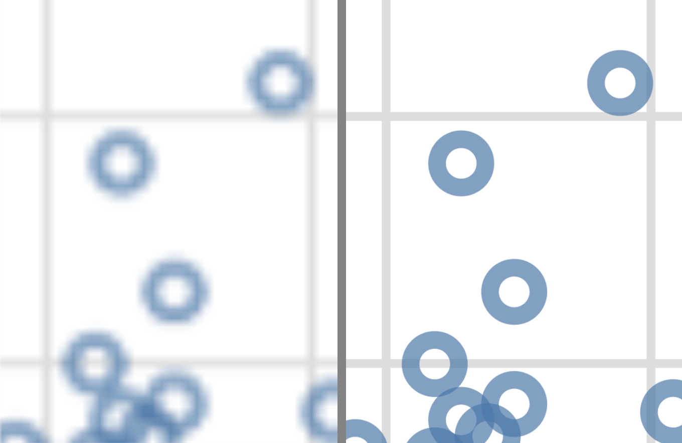
Fig. 4.30 Zoomed in faithful, raster (PNG, left) and vector (SVG, right) formats.#
4.8. Exercises#
Practice exercises for the material covered in this chapter can be found in the accompanying worksheets repository in the “Effective data visualization” row. You can launch an interactive version of the worksheet in your browser by clicking the “launch binder” button. You can also preview a non-interactive version of the worksheet by clicking “view worksheet.” If you instead decide to download the worksheet and run it on your own machine, make sure to follow the instructions for computer setup found in Chapter 13. This will ensure that the automated feedback and guidance that the worksheets provide will function as intended.
4.9. Additional resources#
The altair documentation [VanderPlas et al., 2018] is where you should look if you want to learn more about the functions in this chapter, the full set of arguments you can use, and other related functions.
The Fundamentals of Data Visualization [Wilke, 2019] has a wealth of information on designing effective visualizations. It is not specific to any particular programming language or library. If you want to improve your visualization skills, this is the next place to look.
The dates and times chapter of Python for Data Analysis [McKinney, 2012] is where you should look if you want to learn about
dateandtime, including how to create them, and how to use them to effectively handle durations, etc
4.10. References#
- Dee05
Sameer Deeb. The molecular basis of variation in human color vision. Clinical Genetics, 67:369–377, 2005.
- Har91
Wolfgang Hardle. Smoothing Techniques with Implementation in S. Springer, New York, 1991.
- McK12
Wes McKinney. Python for data analysis: Data wrangling with Pandas, NumPy, and IPython. " O'Reilly Media, Inc.", 2012.
- McN77
Donald R. McNeil. Interactive Data Analysis: A Practical Primer. Wiley, 1977.
- Mic82
Albert Michelson. Experimental determination of the velocity of light made at the United States Naval Academy, Annapolis. Astronomic Papers, 1:135–8, 1882.
- TK20
Pieter Tans and Ralph Keeling. Trends in atmospheric carbon dioxide. 2020. URL: https://gml.noaa.gov/ccgg/trends/data.html (visited on 2020-07-04).
- Tim20
Tiffany Timbers. canlang: Canadian Census language data. 2020. R package version 0.0.9. URL: https://ttimbers.github.io/canlang/.
- VGH+18
Jacob VanderPlas, Brian Granger, Jeffrey Heer, Dominik Moritz, Kanit Wongsuphasawat, Arvind Satyanarayan, Eitan Lees, Ilia Timofeev, Ben Welsh, and Scott Sievert. Altair: interactive statistical visualizations for python. Journal of Open Source Software, 3(32):1057, 2018. URL: https://doi.org/10.21105/joss.01057, doi:10.21105/joss.01057.
- Wil19(1,2)
Claus Wilke. Fundamentals of Data Visualization. O'Reilly Media, 2019. URL: https://clauswilke.com/dataviz/.